User Interface
Plugins are based on modern web technology (i.e. HTML + CSS + JavaScript). The main content that you’ll create will render in a webview.
Plugins should be designed to be responsive and adapt to a variety of screen sizes to accommodate a great user experience for both Banno Mobile and Banno Online users.
The Banno Mobile apps for the Garden demo institution are available on Google Play and the App Store.
Plugins are only accessible to users via the banking Dashboard after logging in.
If a plugin is enabled for a user they are able to add it directly to their Dashboard, but they will not be able to access the plugin from outside the Dashboard context.
Alternatives to plugins
Plugins have a specific look-and-feel, work well for many situations, and are an excellent way to extend Banno’s user interface.
However, if you wish to extend Banno’s UI in ways which do not fit the typical pattern for a plugin, then you may want to consider creating an External application with a different link type.
For more information on other link types, see these topics on Knowledge.Banno.com:
Anatomy
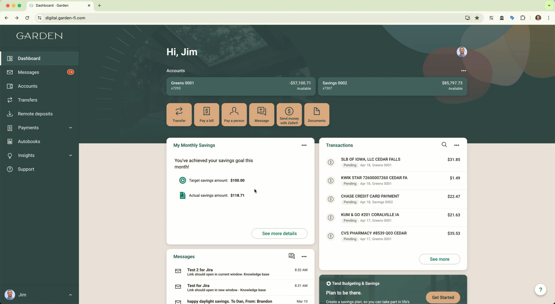
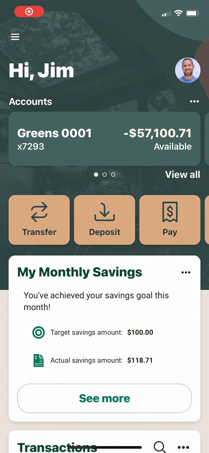
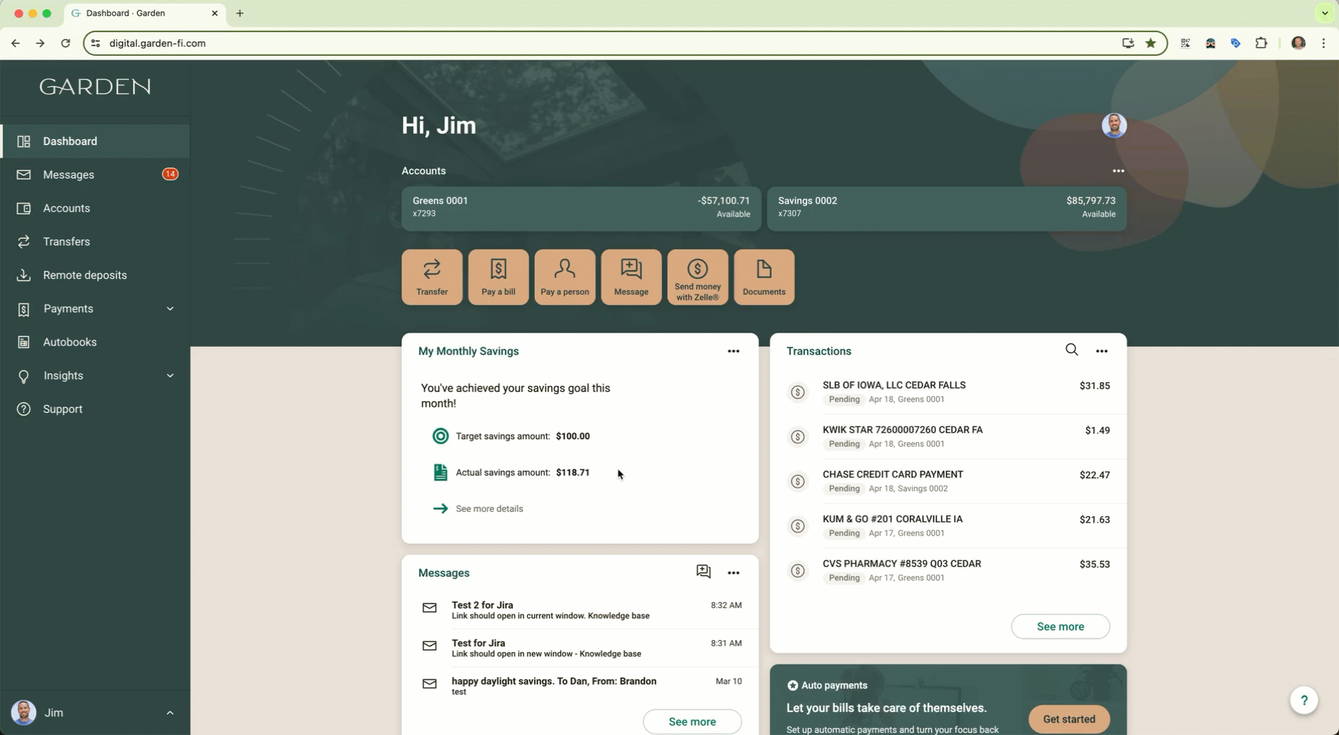
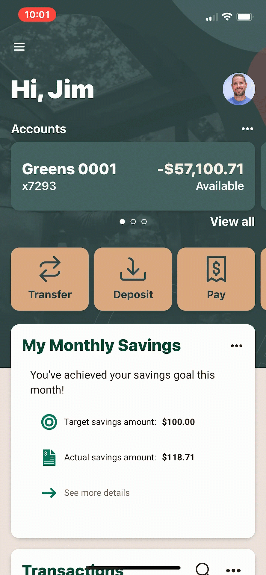
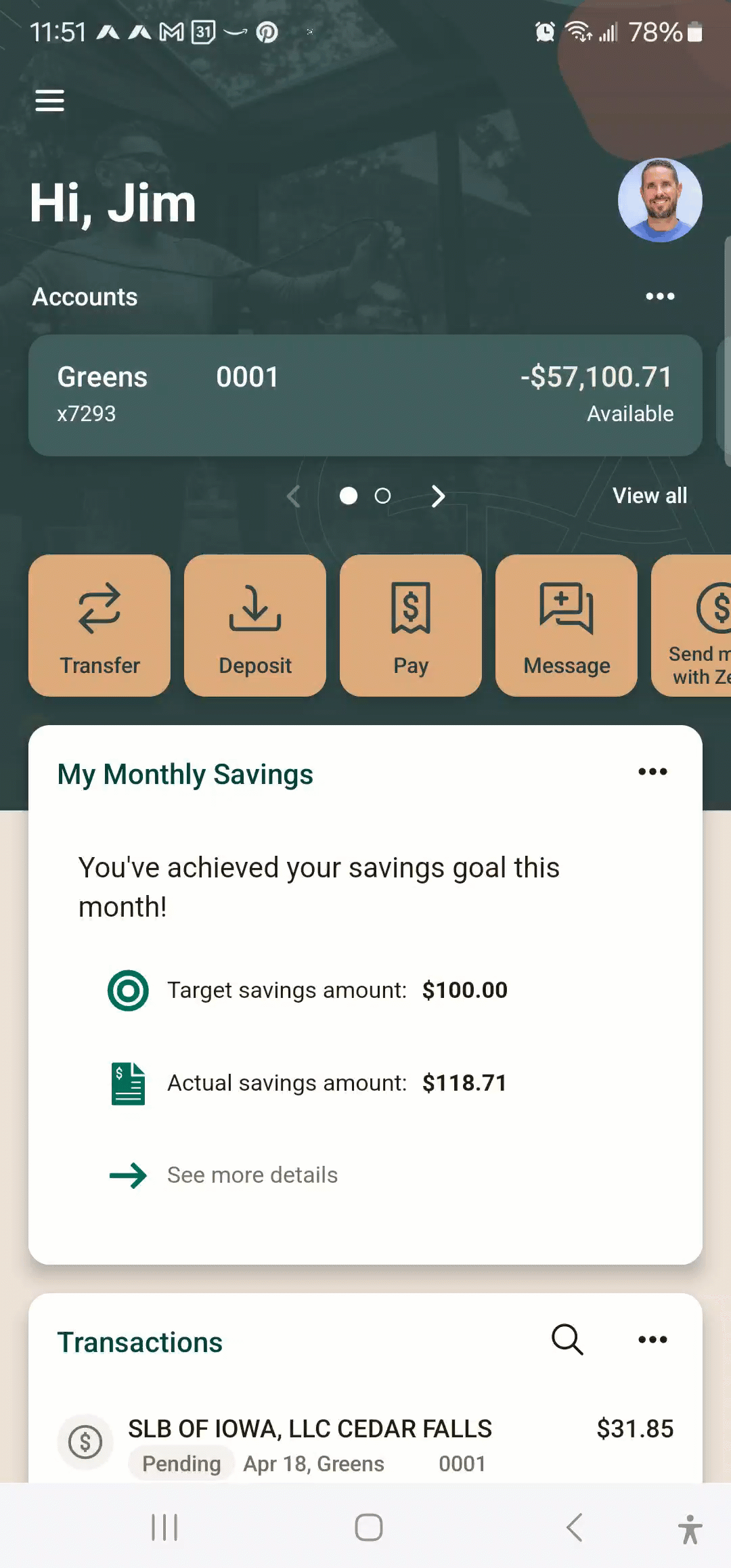
Plugins are rendered as UI summary cards on the Dashboard of our apps. An optional primary action leads users to a full screen webview.
Card face
Card face sections
1. Card title
- The Title displayed in the card’s header. Determined by your plugin configuration.
2. Ellipsis menu
- The ellipsis menu opens a menu for the card. More on this in the Card menu section.
3. Webview
- The webview contains your web app’s content.
- Its size is determined by the Initial height in your plugin configuration.
- The web address to be loaded is determined by the External Application in your plugin configuration.
4. Primary action button (optional)
- This natively-drawn button leads to a full-screen embedded webview of your External Application.
- The action button Label and the expanded view External Application are determined by your plugin configuration.
- If there is no primary action button configured, the bottom edge of the webview becomes the bottom edge of the card.
Any web server that wants to render the webview content for a plugin card MUST allow for iframing.
- Troubleshooting: If you are seeing the plugin card’s UI chrome (e.g. card title, ellipsis menu, primary action button) but cannot see the content in the webview because it shows a “refused to connect” error, or similar, see our Plugin Troubleshooting notes.
Plugins should not require scrolling within the card face, because this leads to a poor user experience of ‘scrolling-inside-of-scrolling’ within the Dashboard.
- NOTE: Scrolling is not necessarily restricted, but it is also not officially supported, so there may be differences in behavior between Banno Online, Banno Mobile (Android), and Banno Mobile (iOS).
The expanded view is where you can show more detail beyond what would fit on the card face.
An alternative to configuring a primary action button is to use the @jack-henry/banno-plugin-framework-bridge JavaScript module to route click events (such as triggering the Expanded View).
- See the @jack-henry/banno-plugin-framework-bridge topic for details.
Web vs. mobile
Plugins are available to users on both desktop and mobile applications, without any modification to your plugin. However, you should keep in mind that the experience is slightly different.
Web
In the web interface, the card face uses the webview to display information to the user. Tapping the action button will open a larger, full-screen webview which you can use to render larger content. In order to navigate back to the dashboard, users use the browser’s back button.
Mobile
In the mobile interface, the card face uses the webview to display information to the user. Tapping the action button will open an additional, larger webview within the existing mobile view. Closing the larger view returns the user to the mobile dashboard view.
Expanded view
Expanded view sections
Pressing the primary action button in the card face displays a full-screen view of content in the expanded view, which includes the following.
- 1. Plugin title
- The same as the card Title displayed in the card face. Determined by your plugin configuration.
- 2. Done button
- This button closes the modal view that contains the webview. This is not configurable.
- 3. Webview
- The webview contains your web app’s content.
- The external application to be loaded is determined by your plugin configuration.
Web vs. mobile
Card menu
- 1. Card title
- The same as the card Title displayed in the Card Face. Determined by your plugin configuration.
- 2. Icon
- An Icon of your choice from our available options. Determined by your plugin configuration.
- This icon is also used in the Organize Dashboard view when the user adds a card.
- 3. Organize Dashboard
- All card menus contain a button that navigates the user to where they can change the dashboard card order.
Organize dashboard
- 1. Card title
- The same as the card Title displayed in the Card Face. Determined by your plugin configuration.
- 2. Icon
- The same as the Icon displayed in the Card Menu. Determined by your plugin configuration.
- 3. Card description
- The short Description of your card. Determined by your plugin configuration.
Plugin cards might not be shown by default.
Also note that the user can change their dashboard configuration, so plugins may appear in the Add a card menu within the Organize Dashboard control.
Transitions between the card face view and the expanded view
The images below illustrate the transition from card face view to expanded view and back in Banno Online and Banno Mobile, for both the action button and plugin bridge approaches. You can click any image below to view it at a larger size.
The user presses the plugin's action button to transition to the expanded view, then presses the browser's back button to return to Banno Online.
The user presses the plugin's action button to transition to the expanded view, then presses the Back button to return to Banno Mobile.
The user presses the plugin's action button to transition to the expanded view, then presses the "X" button to return to Banno Mobile.
The user presses the "See more details" link in the plugin to transition to the expanded view, then presses the browser's back button to return to Banno Online.
The user presses the "See more details" link in the plugin to transition to the expanded view, then presses the Close button to return to Banno Mobile.
The user presses the "See more details" link in the plugin to transition to the expanded view, then presses the "X" button to return to Banno Mobile.
Theming
Plugins should render themselves in a pleasing way that matches the theme configured for your financial institution in Banno.
There are two different ways to retrieve the configured theme for your financial institution: (1) the Institutions API and (2) the Identity Token (when authenticating a user).
If you do not want to use the Banno theme data and instead prefer to render your content using generic light and dark mode support, then you’ll have to take appropriate action on a per-platform basis.
Institutions API
The Institutions API is offered as part of the Consumer API and is the best way to retrieve the theme data for your financial institution.
Part of the Institutions API is the themes` endpoint to retrieve the themes configured for an institution. You should use the theme values returned from this API to create styles to match your plugin’s design to the themes configured for your financial institution in Banno.
In practice, financial institutions do not modify their theme on a frequent basis. This means that developers can retrieve the theme info, offline, then make that theme a static part of the configuration of the plugin for that specific institution.
This has the added benefit of being in line with our guidance on caching for performance (where possible).
Light theme vs dark theme selection
The Banno UI uses the system settings / browser settings to determine whether to show the light theme or the dark theme.
The user cannot directly choose a theme. They can only indirectly change the theme by changing their settings to light mode or dark mode.
External resources
Handling dark mode and other color schemes
- Article: Dark Mode Support in WebKit
- Video: Supporting Dark Mode in Your Web Content
- Spec: prefers-color-scheme
Responsive and adaptive web design
- Article: 9 basic principles of responsive web design
- Article: Responsive web design basics
- Article: The building blocks of responsive design
- Reference: Responsive Web Design - Images
- Have a how-to question? Seeing a weird error? Get help on StackOverflow.
- Register for the Developer Office Hours where we answer technical Q&A from the audience.